ONLINE BANKING

ONLINE BANKING

Reducing the gap between online banking platforms

Reducing the gap between online
banking platforms

[research]
[UX/UI]
[accessibility]
[overview]

MA Final Major Project · Falmouth University · August 2025 · Sole researcher and designer

MA Final Major Project · Falmouth University · August 2025 ·
Sole researcher and designer

8 Interviews conducted

UK-based, aged 24–74

8 Interviews conducted

UK-based, aged 24–74

4 Usability test participants

Moderated, mobile and desktop

75% less confusion

Users navigated both platforms without relearning the interface

4x task completion

vs non-customisable banking apps

4x task completion

vs non-customisable banking apps

8 Interviews conducted

UK-based, aged 24–74

75% less confusion

Users navigated both platforms without relearning the interface

4 Usability test participants

Moderated, mobile and desktop

4x task completion

vs non-customisable banking apps

[the problem]

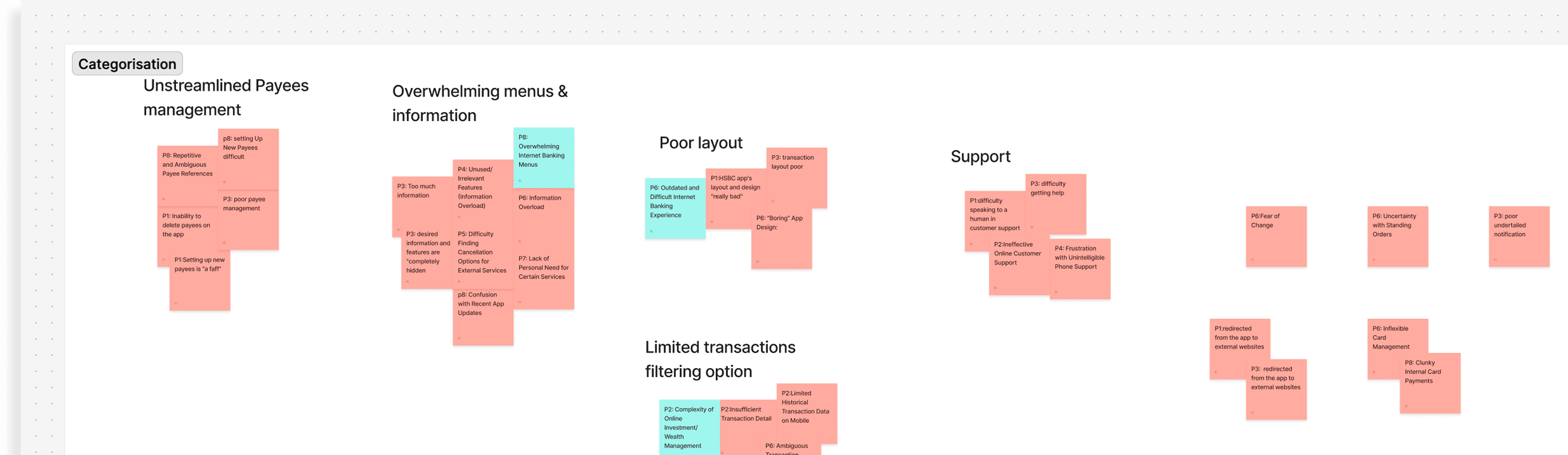
I started noticing the problems with people around me. Someone struggled to find their bank statement. Someone couldn't find a simple task on their desktop online banking platform when they had no problem with the mobile app. Small things, but they happened constantly, and they clearly caused real stress.


When I dug into why, one pattern kept coming up. People weren't confused because they didn't understand banking. They were confused because the mobile app and the desktop platform felt like two completely different products. The layout adjusted for the device (fine!) but the structure, the navigation, the order of things, none of it matched. Every time someone switched platforms, they had to relearn where everything was.


Two participants put it plainly during the interview:

"The layout feels like there's too much information especially when I use my laptop and the stuff you actually want always feels completely hidden."

"I couldn't find the mortgage information on the mobile app then I went on to my laptop and everything looks completely different."

Behind both quotes is the same problem: people who knew what they needed but couldn't find it. That's not a minor inconvenience. That's a barrier to financial independence.

[the research]

I interviewed 8 UK-based participants (recruited through family, friends, and local Facebook group) ranging from 24 to 74 years old. I wanted a real spread of digital confidence, not just tech-comfortable users.


I also conducted an expert review of three major UK platforms: Lloyds, HSBC, and Monzo. Monzo, notably, has no desktop platform at all which is already a significant gap for users who prefer or need to complete certain tasks on a computer. Lloyds and HSBC both offered mobile and desktop, but with noticeably inconsistent navigation structures between the two.


The interviews confirmed what the expert review suggested. The core problem wasn't any single feature but it was that users had to hold two different mental models of the same product in their head simultaneously. That cognitive load was exhausting, and for some users it was a genuine barrier to managing their own money confidently.

[the insight]

If I could make the navigation structure identical across mobile and desktop so that anything users learn to find on their phone exists in exactly the same place on their laptop then I could remove that mental overload.


Paired with a customisable dashboard that lets users choose what appears on their home screen, the design could go further: not just consistent, but personal. They see what matters to them. Everything else is still there, just not in their way.


The customisable dashboard in one sentence: Users pick what they want to see and do on their main screen, and the platform remembers it.

[the process]

I went straight to Figma rather than paper sketching because I find it faster to think through problems when I can undo and iterate in real time.


The hardest decision was how to make navigation feel genuinely learnable across both platforms without it feeling forced or compromised on either. I designed two different desktop navigation structures and tested both during usability testing to find which felt more intuitive. One used a top navigation bar consistent with most desktop banking conventions. The other moved the menu into the body of the page, closer to how mobile bottom navigation works spatially. Testing made the decision clear.


The design system took around 2.5 weeks to build which is longer than I should have allowed. I got caught in trying to make it perfect. What I'd do differently in the future is build it as I go and use that time for more interviews or more sketching instead. A good design system is a scalable one that grows with the work, not a perfect one that delays it.


Everything was built on design tokens (primitives, semantics, then components) so that accessibility decisions like colour contrast and typography were structural rather than a checklist at the end. Atkinson Hyperlegible was chosen as the typeface specifically because it was co-designed with the visually impaired community and built for legibility at small sizes.


I went straight to Figma rather than paper sketching because I find it faster to think through problems when I can undo and iterate in real time.


The hardest decision was how to make navigation feel genuinely learnable across both platforms without it feeling forced or compromised on either. I designed two different desktop navigation structures and tested both during usability testing to find which felt more intuitive. One used a top navigation bar consistent with most desktop banking conventions. The other moved the menu into the body of the page, closer to how mobile bottom navigation works spatially. Testing made the decision clear.


The design system took around 2.5 weeks to build which is longer than I should have allowed. I got caught in trying to make it perfect. What I'd do differently is build it as I go, use that time for more interviews or more sketching instead. A good design system is a scalable one that grows with the work, not a perfect one that delays it.


Everything was built on design tokens — primitives, semantics, then components — so that accessibility decisions like colour contrast and typography were structural rather than a checklist at the end. Atkinson Hyperlegible was chosen as the typeface specifically because it was co-designed with the visually impaired community and built for legibility at small sizes.

[test it]

Four participants tested the prototype across both mobile and desktop in a moderated usability study. The finding I was most pleased with: users found one of the proposed navigation design is easy to learn and said they could complete tasks without having to go through multiple steps or clicks to find what they needed.


Compared to testing the same tasks on their real banking apps, they accessed features four times faster on the prototype.


But not everything worked as I expected.


I'd designed a 'preview changes' step into the dashboard customisation flow, the idea being that users could see how their dashboard would look before committing to saving it. It felt like a thoughtful addition. In testing, 75% of participants missed it entirely and thought they'd already saved their changes when they hadn't.


I removed the preview step. Users can now save directly after adding a menu item, and can always remove it afterwards if they change their mind.

[the outcome]

75% of participants found the navigation consistent and familiar across both platforms, the core problem the project set out to solve. Task completion was four times faster on the proposed design compared to existing non-customisable banking platforms.

More than the numbers, what stayed with me was how participants described the experience. Easy to learn. Everything where they expected it. No unnecessary steps.

For users who had described digital banking as overwhelming, confusing, or embarrassing , that simplicity is the point.

[reflection]

This project taught me the difference between designing for a brief and designing for real people. A brief has business priorities and constraints. Real people have a guy who needs his family or friends next to him to make a bank transfer because he couldn't navigate the platform.

When you design for real people, the decisions become clearer. Not easier, but clearer. You know what matters and what doesn't.

If I did this again, I'd spend less time perfecting the design system and more time in other work such as doing more interviews, sketching more solutions, and testing earlier in the process. The best design system is one that grows with the work, not one that holds the work up.

And I'd remind myself earlier that a finding that complicates your solution is more valuable than one that confirms it.

This project taught me the difference between designing for a brief and designing for real people. A brief has business priorities and constraints. Real people have a guy who needs his wife next to him to make a bank transfer because he's scared of getting it wrong again.

When you design for real people, the decisions become clearer. Not easier, but clearer. You know what matters and what doesn't.

If I did this again, I'd spend less time perfecting the design system and more time in other work such as doing more interviews, sketching more solutions, and testing earlier in the process. The best design system is one that grows with the work, not one that holds the work up.

And I'd remind myself earlier that a finding that complicates your solution is more valuable than one that confirms it. The preview button taught me more about my users than any interview question did.

© Fibria - 2026

© Fibria - 2026

© Fibria - 2026